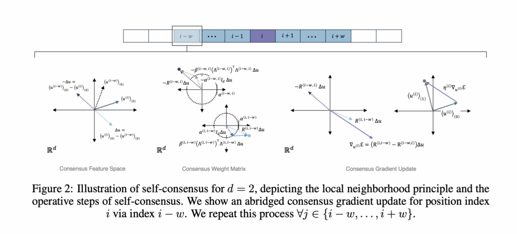
Anthrogen has introduced Odyssey, a family of protein language models for sequence and structure generation, protein editing, and conditional design. The production models range from 1.2B to 102B parameters. The Anthrogen’s research team positions Odyssey as a frontier, multimodal model for real protein design workloads, and notes that an API is in early access. https://www.biorxiv.org/content/10.1101/2025.10.15.682677v1.full.pdf What problem does Odyssey target? Protein design couples amino acid sequence with 3D structure and with functional context. Many prior models adopt self attention, which mixes information across the entire sequence at once. Proteins follow geometric constraints, so long range effects travel through local neighborhoods in 3D. Anthrogen frames this as a locality problem and proposes a new propagation rule, called Consensus, that better matches the domain. https://www.biorxiv.org/content/10.1101/2025.10.15.682677v1.full.pdf Input representation and tokenization Odyssey is multimodal. It embeds sequence tokens, structure tokens, and lightweight functional cues, then fuses them into a shared representation. For structure, Odyssey uses a finite scalar quantizer, FSQ, to convert 3D geometry into compact tokens. Think of FSQ as an alphabet for shapes that lets the model read structure as easily as sequence. Functional cues can include domain tags, secondary structure hints, orthologous group labels, or short text descriptors. This joint view gives the model access to local sequence patterns and long range geometric relations in a single latent space. https://www.biorxiv.org/content/10.1101/2025.10.15.682677v1.full.pdf Backbone change, Consensus instead of self attention Consensus replaces global self attention with iterative, locality aware updates on a sparse contact or sequence graph. Each layer encourages nearby neighborhoods to agree first, then spreads that agreement outward across the chain and contact graph. This change alters compute. Self attention scales as O(L²) with sequence length L. Anthrogen reports that Consensus scales as O(L), which keeps long sequences and multi domain constructs affordable. The company also reports improved robustness to learning rate choices at larger scales, which reduces brittle runs and restarts. https://www.biorxiv.org/content/10.1101/2025.10.15.682677v1.full.pdf Training objective and generation, discrete diffusion Odyssey trains with discrete diffusion on sequence and structure tokens. The forward process applies masking noise that mimics mutation. The reverse time denoiser learns to reconstruct consistent sequence and coordinates that work together. At inference, the same reverse process supports conditional generation and editing. You can hold a scaffold, fix a motif, mask a loop, add a functional tag, and then let the model complete the rest while keeping sequence and structure in sync. Anthrogen reports matched comparisons where diffusion outperforms masked language modeling during evaluation. The page notes lower training perplexities for diffusion versus complex masking, and lower or comparable training perplexities versus simple masking. In validation, diffusion models outperform their masked counterparts, while a 1.2B masked model tends to overfit to its own masking schedule. The company argues that diffusion models the joint distribution of the full protein, which aligns with sequence plus structure co design. https://www.biorxiv.org/content/10.1101/2025.10.15.682677v1.full.pdf Key takeaways Odyssey is a multimodal protein model family that fuses sequence, structure, and functional context, with production models at 1.2B, 8B, and 102B parameters. Consensus replaces self attention with locality aware propagation that scales as O(L) and shows robust learning rate behavior at larger scales. FSQ converts 3D coordinates into discrete structure tokens for joint sequence and structure modeling. Discrete diffusion trains a reverse time denoiser and, in matched comparisons, outperforms masked language modeling during evaluation. Anthrogen reports better performance with about 10x less data than competing models, which addresses data scarcity in protein modeling. Editorial Comments Odyssey is impressive model because it operationalizes joint sequence and structure modeling with FSQ, Consensus, and discrete diffusion, enabling conditional design and editing under practical constraints. Odyssey scales to 102B parameters with O(L) complexity for Consensus, which lowers cost for long proteins and improves learning-rate robustness. Anthrogen reports diffusion outperforming masked language modeling in matched evaluations, which aligns with co-design objectives. The system targets multi-objective design, including potency, specificity, stability, and manufacturability. The research team emphasizes data efficiency near 10x versus competing models, which is material in domains with scarce labeled data. Check out the Paper, and Technical details. Feel free to check out our GitHub Page for Tutorials, Codes and Notebooks. Also, feel free to follow us on Twitter and don’t forget to join our 100k+ ML SubReddit and Subscribe to our Newsletter. Wait! are you on telegram? now you can join us on telegram as well. The post Anthrogen Introduces Odyssey: A 102B Parameter Protein Language Model that Replaces Attention with Consensus and Trains with Discrete Diffusion appeared first on MarkTechPost.