This is the most misunderstood graph in AI
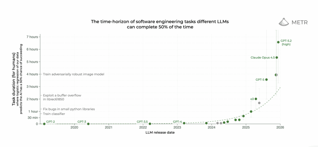
MIT Technology Review Explains: Let our writers untangle the complex, messy world of technology to help you understand what’s coming next. You can read more from the series here. Every time OpenAI, Google, or Anthropic drops a new frontier large language model, the AI community holds its breath. It doesn’t exhale until METR, an AI research nonprofit whose name stands for “Model Evaluation & Threat Research,” updates a now-iconic graph that has played a major role in the AI discourse since it was first released in March of last year. The graph suggests that certain AI capabilities are developing at an exponential rate, and more recent model releases have outperformed that already impressive trend. That was certainly the case for Claude Opus 4.5, the latest version of Anthropic’s most powerful model, which was released in late November. In December, METR announced that Opus 4.5 appeared to be capable of independently completing a task that would have taken a human about five hours—a vast improvement over what even the exponential trend would have predicted. One Anthropic safety researcher tweeted that he would change the direction of his research in light of those results; another employee at the company simply wrote, “mom come pick me up i’m scared.” Credit: METR.ORG But the truth is more complicated than those dramatic responses would suggest. For one thing, METR’s estimates of the abilities of specific models come with substantial error bars. As METR explicitly stated on X, Opus 4.5 might be able to regularly complete only tasks that take humans about two hours, or it might succeed on tasks that take humans as long as 20 hours. Given the uncertainties intrinsic to the method, it was impossible to know for sure. “There are a bunch of ways that people are reading too much into the graph,” says Sydney Von Arx, a member of METR’s technical staff. More fundamentally, the METR plot does not measure AI abilities writ large, nor does it claim to. In order to build the graph, METR tests the models primarily on coding tasks, evaluating the difficulty of each by measuring or estimating how long it takes humans to complete it—a metric that not everyone accepts. Claude Opus 4.5 might be able to complete certain tasks that take humans five hours, but that doesn’t mean it’s anywhere close to replacing a human worker. METR was founded to assess the risks posed by frontier AI systems. Though it is best known for the exponential trend plot, it has also worked with AI companies to evaluate their systems in greater detail and published several other independent research projects, including a widely covered July 2025 study suggesting that AI coding assistants might actually be slowing software engineers down. But the exponential plot has made METR’s reputation, and the organization appears to have a complicated relationship with that graph’s often breathless reception. In January, Thomas Kwa, one of the lead authors on the paper that introduced it, wrote a blog post responding to some criticisms and making clear its limitations, and METR is currently working on a more extensive FAQ document. But Kwa isn’t optimistic that these efforts will meaningfully shift the discourse. “I think the hype machine will basically, whatever we do, just strip out all the caveats,” he says. Nevertheless, the METR team does think that the plot has something meaningful to say about the trajectory of AI progress. “You should absolutely not tie your life to this graph,” says Von Arx. “But also,” she adds, “I bet that this trend is gonna hold.” Part of the trouble with the METR plot is that it’s quite a bit more complicated than it looks. The x-axis is simple enough: It tracks the date when each model was released. But the y-axis is where things get tricky. It records each model’s “time horizon,” an unusual metric that METR created—and that, according to Kwa and Von Arx, is frequently misunderstood. To understand exactly what model time horizons are, it helps to know all the work that METR put into calculating them. First, the METR team assembled a collection of tasks ranging from quick multiple-choice questions to detailed coding challenges—all of which were somehow relevant to software engineering. Then they had human coders attempt most of those tasks and evaluated how long it took them to finish. In this way, they assigned the tasks a human baseline time. Some tasks took the experts mere seconds, whereas others required several hours. When METR tested large language models on the task suite, they found that advanced models could complete the fast tasks with ease—but as the models attempted tasks that had taken humans more and more time to finish, their accuracy started to fall off. From a model’s performance, the researchers calculated the point on the time scale of human tasks at which the model would complete about 50% of the tasks successfully. That point is the model’s time horizon. All that detail is in the blog post and the academic paper that METR released along with the original time horizon plot. But the METR plot is frequently passed around on social media without this context, and so the true meaning of the time horizon metric can get lost in the shuffle. One common misapprehension is that the numbers on the plot’s y-axis—around five hours for Claude Opus 4.5, for example—represent the length of time that the models can operate independently. They do not. They represent how long it takes humans to complete tasks that a model can successfully perform. Kwa has seen this error so frequently that he made a point of correcting it at the very top of his recent blog post, and when asked what information he would add to the versions of the plot circulating online, he said he would include the word “human” whenever the task completion time was mentioned. As complex and widely misinterpreted as the time horizon concept might be, it does make some basic sense: A model with a one-hour time
This is the most misunderstood graph in AI Read Post »